Archive for the 'Interface Design/Product Development' Category

Thursday, October 17th, 2013

[This article was originally written for the Association of American Publishers (AAP) PreK-12 Learning Group and can be found here.]

What do traditional publishers need to know to enter the digital world of publishing?

The publishing world has been on the edge of major change now for well over a decade. Digital media and all the different content delivery platforms are here to stay, and the traditional print model is being challenged in many ways publishers have wished to avoid. I find myself in discussions where the old adage “Video killed the radio star” keeps coming up. The reality however is that video didn’t really kill the radio star, but it did change the future of radio forever. The same is true today with interactive devices, tablets, and smart phones. Traditional publishing is now and forever changed as a result of digital.

I’ve worked in interactive product development for over 20 years now and put together a few thoughts about what is important to know in making the leap to digital. What “must-have” knowledge is important, and why? I offer you these top five observations.

Interactive media is different

That sounds obvious, but many publishers have difficulty in grasping the finer nuances of interactive media. Print media is largely a one-way conversation. Interactive media at its best draws in the user, as a participant, often times creating a two-way interactive conversation. Interactive content, the user interface, and the user experience are often different and unique for each user group or age. In print we may talk about the correct language level of the written word. In interactive there are usability considerations. In a nutshell passive media, like books, magazines, television, and movies, has a viewer; interactive media has a user.

Understand the strengths (and place) of engineers and executive editors

I’ve seen many a publisher hire a hot-shot engineer and relinquish all product development control to that person. The thinking is that “They should know how to make a successful product. They’re the engineer!” Unless that engineer has a great depth of experience in content, usability or instructional design, you are about to make the world’s worst interactive product. Related to this observation (and many people will hate what I have to share next, ) the same can be said about the executive editor. Editors often have a wealth of print and content experience and little to no interactive experience. This too is a common mistake, and one that really ruffles feathers at traditional publishers. There is a place for the editor, just as there is a place for the engineer, but knowing what talent works on what part of the project to make the best interactive learning experience is an effort in rethinking through the expertise of each member of your team. Traditional roles do not port to digital in a straight-forward way. Be prepared for some disruption.
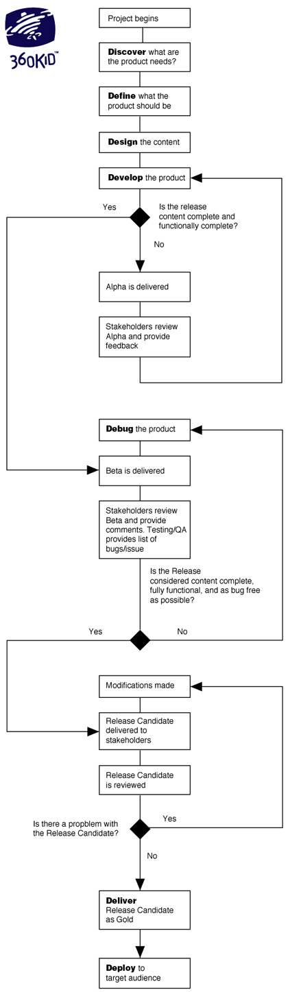
Have a road map

The best interactive products have a development plan. Before a single line of code is written or pixel created in Photoshop a detailed plan is created that defines the product. Often times this road map for development is referred to as a design document, or design spec. Complex projects might also have a technical spec. These documents are not only helpful to bring an entire team up to speed about what exactly is being built, but they are also important documents for your quality assurance (or QA) testers. How will your development and QA team know when your product is actually done without a defined plan to compare against?

[Related article: Want to Make an App for Kids? — Getting Started]

Test your product

There are a few different ways to test an interactive product, and all approaches are invaluable. First off, the quality assurance part of a project is not a line item expense that can be eliminated. I have seen executives cross it right off of a product plan as an unnecessary expense. Many cost conscious publishers mistakenly decide that quality assurance testing need not be part of something they’re working on. While you may have absolute faith in the content portion of your product because your team knows content, the best software development teams rely on QA testing to help improve the finished product. Many a product fails within moments after its release due to sloppy development, or even simple innocent coding mistakes that should have been caught and corrected during the QA process.

Test with an audience

An even bigger oversight is not testing a product during development with the target audience. A common complaint I hear from educational product companies is that kids are so engaged by videogames and television that they can’t compete from an interest or engagement perspective in the classroom. Well, what is it that game developers and broadcasters do to help ensure that kids love their products? They test their products with their target audience! When have you ever heard of such a thing in the publishing world?! That’s crazy talk right? Well, as different media formats mature, it might not be such a crazy idea in the future to test your interactive product out with the target audience that will ultimately use them. User testing could be the new normal in publishing. Even if you think the idea of user testing is crazy, trust me, you will learn something. At very least you will learn new, invaluable ways to shape future products. I can guarantee it.

[Related article: Kid Testing and Facebook — What? Are You Crazy?!]

While there are additional points I could add, having an understanding with the above list is a great place to start. Shipping a quality product by traditional publishing means is always hard and takes a team years of experience to master. Shipping a quality interactive product that engages an audience in the digital world is also hard. Understanding the differences between old and new media types is essential for future product success, and providing a path to step confidently into the future of digital publishing.

Average Rating: 4.4 out of 5 based on 289 user reviews.

Tuesday, September 17th, 2013

The 360KID 7D Development Process to developing software products,  including iOS and Android apps.

How much does it cost to develop a children’s app? How long does it take? What are the steps involved? What kind of talent do I need? These are questions I’m often asked by individuals and companies who want to build an app, and I always reply the same way: “Well, it depends…”

There are so many factors that influence the cost, timing, and talent needed to develop a successful kids interactive product, but it almost always starts with defining the product. What exactly is the vision? How well is that vision considered and detailed? Coming to a development cost and project plan for an app is a lot easier to do with a detailed design document than a single page overview, though what we usually see is the latter rather than the former.

Many people are interested in building apps, but don’t know where to begin, nor what are the necessary steps to create a digital product. Most need a guiding hand to launch an app successfully into the marketplace.

Over the years my team created an overview to help explain the software development process in an easy to understand, straight forward manner. I call this tool the 7D Development Process. What are the steps found in this process?

Discover, Define, Design, Develop, Debug, Deliver, Deploy

This is a short, three page document I share with those interested in making an app or any other digital experience for children. (It’s also a good reference for non-kid projects as well.) You can download it here. It’s a simple primer, and one I find helps forward a conversation about how to make that next great children’s product. Below is also a process flowchart from the document. I’d enjoy hearing your thoughts. Please share in the comments below!

Flowchart - The 360KID 7D Development Process
Flowchart – The 7D Development Process. (Click image to see larger version of the chart.)

Average Rating: 4.6 out of 5 based on 295 user reviews.

Tuesday, September 3rd, 2013

How 360KID uses Facebook to find kid testers to improve their digital creations and apps.

This has been a busy year of development for my company. We’ve been creating multiple interactive products for kids. Some are learning apps, some are online games, some electronic toys. Some are for preschoolers, some for tweens. All of them have one thing in common. The completed products must successfully engage kids. In an effort to make sure we are making the best interactive products possible, we need to test our ideas with children. When I say “we” I mean the larger kids industry, not just my company. For those who develop any kind of product or media for kids (especially all those children’s app developers out there! I’m talking to you!) you MUST kid test your products. Get your software builds, your animations, your web games, your characters, your paper prototypes out there in front of real kids! Do not go to market without testing your assumptions, you may find you had it all wrong. Testing is an invaluable part of children’s media development and should be part of every product you make if you work in the kids biz.

There are a number of ways to recruit kids for testing. You can reach out to family and friends, kids in your neighborhood. However, sometimes you need to reach out beyond your known circle and find kids from another location; say kids that live in a city, or bilingual preschoolers, or eight to ten year olds that belong to Girl Scouts, or tweens that like to play baseball. What do you do then?

While you can reach out to specific youth groups, Boys and Girls Clubs, and other kid-focused organizations, you can also use Facebook. Now I know you’re saying “What?! Facebook? For recruiting kid testers? Are you crazy?!” As with all kid testing, you’re starting a conversation with a parent, and recruiting through Facebook means you are looking to have a conversation with a parent about kid testing.

Here’s a more detailed look at one kid testing ad campaign we placed on Facebook. We started by selecting a particular town we wished our testers to come from. The 10 mile radius around that town had 168, 000 parents using Facebook. Selecting a thinner slice from that group, parents with children ages 4 to 12 resulted in 1, 400 Facebook users. When you start a Facebook ad, you can get very specific about the kind of person you wish to reach. Do you want to reach just men 25 years of age or older? How about just women with a PhD? All of this is possible to define in your campaign. However, the more specific you get with your target demographic, the smaller your audience will become.

We posted an ad for kid testers for 45 days, with a maximum bid of $2.50 per click, not to exceed a cost of $50 a day. Our ad appeared over 712, 000 times (impressions), reaching more than 8, 200 Facebook users in our target age and location (demographic), resulting in a click-through rate (CTR) of 427. We heard from about 45 parents, leading to 22 parents bringing in 30 children, all for a total cost of $560, or about $1.30 per click.

Another way to look at our recruiting costs: $25 per parent or about $19 per child. This was just our advertising cost and did not include email communication time, phone calls, testing time, analysis of results, or the stipend we offered a parent for having their child come in to test with us.

Was it worth it? Yes, in the end Facebook definitely helped us find kids from a specific geo-targeted location to test with.

Was it perfect? Hardly. There were many frustrating parts to working with Facebook. First time advertisers will be annoyed that once you place an ad, it can take many days before your campaign is approved and goes live. While you’re waiting, all you can do is think about what you did wrong and why your ad is not producing. During this time you’ll probably change your ad copy and up the daily maximum bid thinking it will help. But hold tight, Facebook is just being Facebook. It takes time for an ad to kick in, and you will receive next to no communication from Facebook while you are pulling out your hair, wondering what’s going on.

Were there any surprises? You bet. While many parents found our ad on Facebook, there were some “uber parents” that helped spread the word around their neighborhood that we were looking for kid testers. About four parents that came in were in this category. They were great at helping reach many more parents, including non-Facebook users as well.

In the end we met many great parents with some wonderful kids. All of which helped us refine our product and made it better. We couldn’t be happier, and our finished product shines as a result of the feedback we incorporated back into development! Thank you parents and our 360KID testers!

Bottom line: It doesn’t matter how you find kids to test with, using Facebook or some other means, what matters is that you test! Doing so will only help make your product shine, stand out from the pack, and lead to more successful interactions through your product with kids. Now get out there and start testing!

Average Rating: 4.9 out of 5 based on 252 user reviews.

Saturday, December 8th, 2012

[Wendy Smolen is a contributing writer to the KidScreen blog. She is also a friend and co-founder of the annual children’s conference called Sandbox Summit. Wendy asked if I would share with her Kidscreen followers a taste of my forthcoming virtual world report.]

Scott Traylor, head of 360KID, has spent the last few years playing every game he could get his hands on (I know, a tough job!). He’s just finished a comprehensive virtual world report, and I asked him to weigh in on the top 10 Tween Worlds. Download a sample page of the report here or contact Scott for the complete report or more virtual world insights.

Tween friends playing together in a virtual world

Virtual world destinations for children sure have grown. Gone are the days of just Club Penguin and Webkinz. The past few years has seen an explosion of worlds, many specifically directed at kids under twelve. In the interest of assessing data on virtual worlds and MMOs specifically for children, I realized it’s important to follow all virtual worlds. In September, 2011 I had accumulated data for a total of 351 virtual worlds and MMOs. By September 2012, my list included 427 destinations.

When I sorted out the top ten virtual world destinations for tweens, some surprising trends emerged. This past September, the top 10 tween sites made up almost 50% of all virtual world and MMO traffic. Last year, only 36% of all traffic went to the same top ten. While the entire virtual world and MMO space grew 8.5% in that time period, the tween virtual world space grew almost 14%. The tween virtual world space is becoming increasingly stronger and more important.

What do these top worlds have that the others have missed? I have a few theories of my own:

1.) Find that secret sauce. Simply tying together a bunch of games will not do the trick. Find out what motivates your user base. Do kids in your target audience love horses? Or nurturing a pet? Maybe it’s all about sharing something creative with others. When you define one singular item, everything else will stem from that idea. Without it, your world will become just another virtual ghost town. Every successful world has something special. One great example is Club Penguin, where there are constant celebrations going on. What child doesn’t like to go to a party! Once you recognize parties are a driver, everything you do around that theme drives the engagement, including the games, custom costumes, even conversation.

2.) The real work begins after launch. Most new worlds fail within three to four months after launch. The initial peak in traffic is often followed by a giant decline. I see it over and over again with the data I’ve collected. “If you build it they will come” may be true at first, but if you don’t update it they will leave. Users constantly expect something fresh to be happening. New content needs to be added on a regular basis. While too many virtual world teams spend most of their development dollars getting to launch, the successful worlds spend half of their budget getting to launch, and the other half afterwards. Poptropica started with one island in 2007; 30 additional islands have been added to the world over time. Each island enriches the experience and keeps users coming back for more.

3.) Users know best. When I talk to people who work at the top ten virtual worlds, again and again they say: listen to your users. Many of the best improvements often come from players. And it’s not only important to listen, but to share that you have heard their suggestions. While it will probably be impossible to implement every idea, some may have the strength and validity to automatically rise to the top. Wizard101 solicits feedback from active users who have made a virtual purchase in the last 30 days. This sizable group has access to test realms and new content updates for two or three weeks in advance of them being posted to the entire community. During that time, they share feedback with the development team, offering real suggestions for increasing the engagement. And of course, feel empowered as loyal users.

As crowded as today’s virtual space is, it’s only going to get more so, before new worlds and ideas bubble to the top. Don’t jump in and expect things to be easy. You need to watch, learn, ask lots of questions, and, most importantly, play. Here’s hoping to see you on the top ten list next year.

Send comments to Scott (at) 360KID (dot) com or wendy (at) sandboxsummit (dot) org.

Average Rating: 4.5 out of 5 based on 278 user reviews.

Sunday, December 2nd, 2012

A few years ago my father was in hospice care during the last days of his life. Over the span of a couple of weeks his ability to communicate deteriorated rapidly. Not that he couldn’t communicate completely, but a number of barriers prevented his ability to communicate easily. Among them, not having enough energy to speak, or coughing fits in the middle of speaking. Nurses that came and went, as wonderful as they were, often did not speak English as a first language, which also made it hard for him to communicate.

At the time when all of this was happening, I was reflecting on how very young children who have not yet learned how to speak would just use a finger to point to things they wanted. The same is true for a young child using an iPhone, all they need to do is point or swipe. Why is it that using an iPhone or an iPad is so easy for a twelve month old child? In the research world there’s a concept called “cognitive load”. In the context of computing, if you make a user interface easy to use then there are less barriers, less cognitive demands on simply using a computer and more cognitive resources available to take advantage of what you wish to accomplish with a computer. In the context of hospice care and communication there are things a person needs to effectively communicate that have nothing to do with the actual message. For example, having enough energy to speak, the ability to breathe easily, or having minimal muscle coordination, or the ability to use your tongue or larynx. If a person has a message to share with others, the components of communicating like those just mentioned can become barriers for the successful delivery of that message.

First page of the two-page communication tool for helping hospice patients communicate
Sample page of a two-page communication tool for helping hospice patients communicate. (Click image to see larger version and instructions for saving. Version for women also included.)

After a few days of watching my father struggle to be understood I created a paper-based way for him to get his messages across. A thick piece of paper, on each side containing many pictures of things he would ask for in the course of a day. All he would need to do is point to what he wanted on these two pages. Having the ability to communicate by pointing removed the cognitive demands of being able to communicate through talking. Many items on these pages related to his need to be comfortable, moving from bed to couch, then bathroom and back to the bed. I noted a number of hand gestures shared between my mother and father, mostly shorthand for yes or no, good or bad. Also a limited set of preferred food choices, particularly ice chips. Sometimes just water, sometimes juice. This two-sided paper communication tool was easy for my father to use, pointing to what he wanted in times of challenged communication. I made it for him on a Tuesday. He passed away on Thursday. In that short time it helped reduce the frustration of communicating only a handful of times, but it did help.

Second page of the two-page communication tool for helping hospice patients communicate
Second page of a two-page communication tool for helping hospice patients communicate. (Click image to see larger version and instructions for saving. Kosher verson also included.)

Recently another family member started hospice, I’ll call her Mary. Many of the same communication struggles I saw with my father can be seen with Mary, except Mary has less energy and less motor skill coordination than my father. My father had enough energy to point to areas of this two-sided paper tool. Mary does not. While Mary may not have the muscle coordination to use her hands, she does seem to have greater control of her head movements. I started thinking how such a communication tool could be used and thought maybe these pages could be enlarged, printed on a large poster board, and attached to a nearby wall at eye level from sitting upright on a bed. Then a laser pointer could be fixed to a hat, allowing the beam of light to point to items on the poster board Mary might need.

I wish to share what I have learned, along with these communication pages, hoping it can help others. If you would like a copy of these files to print out and use yourself, you can save each individual JPG file by clicking on the images above and read the instructions provided at the top of each page. Both male and female versions are available, including a kosher version for the food page. If you have an iPad or some other similar tablet, one easy way to use these files is to download them from a browser and save the files to a photo application on your device for quick access, removing the need to print.

I know every hospice situation is unique, mine is not the only story. If you have observations of your own about other successful ideas to make communication easier, or other common items requested from an ailing relative in hospice, please do share in the comments below.

Average Rating: 4.5 out of 5 based on 182 user reviews.